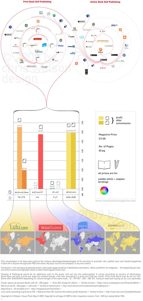
I made this visualisation to help me decide which was the best service to use to self publish visualisation magazine.com which I blogged about its online presence visualisation magazine vol 2 circles.
As I was informed by a member on LinkedIn of Mag Cloud possibly being able to help realise my magazine in print it made me aware of POD (Print-on-demand), which allowed me to discover the many services from Lulu.com to CreateSpace.com (amazon). These 2 were the most well known and used.
So to compare the 4 services that seemed to be the most prominent MagCloud, CreateSpace, Lulu & Blurb (may have seen linked with Flickr) I wanted to compare:
- How they allow online promotion
- Where the service delivers to in the world (didnt want to narrow my market)
- Their profit margins after their production costs for both SQUARE (8.25 x 8.25 varies) & A4
- The services that allow online publishing
I could have added more lines springing from services such as addthis, sharethis, gigya or even RSS feeds but I thought it would be too many levels.
Apart from line crossings of red over the grey circles, their are no red lines crossings (minimise the number of edge crossings), which was quite the challebge re-arranging and technically using bezier curves.
The bar chart I kept lines for money scales so it is easier to compare and decide where the bars reach. I didnt want to go into too many more levels of money as the bar would be extremely long and out of proportion with the rest of the design such as the circles and the maps. So this is why I provided the actual amounts above the end of the bar. I also added the Square paper icons and A4 icons, and faded one if it was a loss or not provided by the site. Lastly I lightened the bars to again help differentiate between A4 service or Square.
I had a box to the right of the bar just to show my specifications of full colour, saddle stitch (stapled), I had set up an Excel file (http://tinyurl.com/SelfPublishVisualisationData, a google spreadsheet doc) with to calculate my profits/loss etc for how many 'pages' and 'price' variables to change (it did end up more pages then 60), and the colour key. Below the bars is the spec's sizes for each service as they are slight variations.
These specs's sizes then lead off to graduations of white to the individual colours and the company/sites logos, brands. I widened them so that my world maps were not too small where i used a basic colour fill of the individual countries the service delivers to. I didnt again want to make them too big and out of proportion to the rest of the design, if you download it I'ver kept enough resolution quality so you can zoom in and see the indiviudally labelled countries on the maps to see if they are colour filled to to see if they deliver there.
This data mining of the countries they deliver to and the time of filling in the colour over eeach country was a time concsuming activity.
Well, I am pleased with it as it was a challenge researching, finding data, I did the three sections individually and managed to bring them together ok. Do like the gradients of colour to the world maps, makes it a little more aesthetically pleasing but still functional and the viral look of the circles infecting different levels and depths of the web, really nice visual rhetoric.
Volume 2 Circles See who is featured Purchase a copy on Amazon
.
.
Click thumbnail for larger image.
Please share your opinions, comments. I will post a making of / how to make your own mag post soon.
All sites and useful self publishing links.
Comparisons and How to make your book/magazine sites
http://www.mequoda.com/articles/online-publishing/which-online-self-publishing-site-is-right-for-you/
- excellent post that collates online self publishing sites and their advantages / disadvantages
http://www.bitwisemag.com/2/Publish-And-Be-Damned
- excellent post telling you details about some of the sites mentioned above but also going to great depth telling you how you can make your book magazine such as software to use with Quark express or Adobe InDesign, what settings, resolution etc. also see my making of... http://visualisationmagazine.com/making.htm
http://www.lugaru.com/lulucalc.html
- Compare Lulu.com with CreateSpace (amazon) and calculate your costs of the type and style of book/magazine you desire (little out of date but still useful).
Useful Sites
http://www.royalmail.com/portal/rm/content1?catId=400036&mediaId=53800712
- calculate UK postage costs
http://www.xe.com/ucc/convert.cgi
- convert your $ prices to euro, £.
POD Publishing Sites
http://www.lulu.com/ - think they are UK based.
https://www.createspace.com/Products/Book/ - US based. mickrooney.blogspot.com createspace reviewed very thorough and vast blog on POD sites/services
http://www.blurb.com/ - you may have seen them affiliated through Flickr.
http://magcloud.com/ - US based.
https://www.lightningsource.com/ - UK based.
Online Publishing Sites
http://issuu.com/ - I chose these as they let me publish documents privately (not seen by google) so that I can customise the embed viewer (remove print button).
http://www.slideshare.net/ - not so much book/magazine style but still provides a good embed viewer - more for powerpoints/presentational documents.


1 comment:
I love your article. you can visit my website.
get android version
Post a Comment