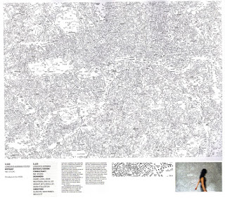
 This is a fantastic typographic exploration of type's place within the visual world of the capital.
 This map won a design award from Aiga and London Design. The information is taken from AZ street maps where the icons, symbols and hard lines representing churches, streets, rivers and parks have been removed from the map, leaving only letters. It is interesting to see Geography and Creative Graphic Design combine as opposed to the separation they seem to have followed. It is a fantastic and visually inspiring/innovative typographic map of London’s street names.
Although this is not so much about knowledge it is visually inspiring to inform ways of seeing, connecting thoughts spatially, creating a spatial immediacy that demands attention.
NB:Studio
Img src: Creative review - the annual 2007
Good review
No comments:
Post a Comment